Shop tags
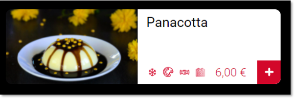
If you work withItemTAGs in the customer master and you have activated the tags in the portal, they will be displayed in your shop or app.

Up to 4 tags can be displayed per item in the item list.

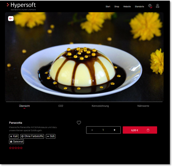
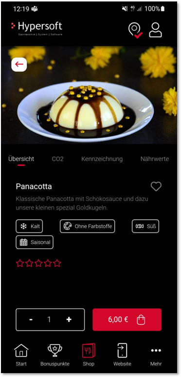
If more than 4 tags are assigned to an item, they will be displayed in the item details.


View in the selection...
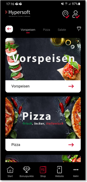
In the views of the product group and item selection, a filter icon is displayed at the top right, which your users can use to define their preferences.

Definition by User...
If the filter button is pressed, your users can individually determine which tags they like and which they do not:

By clicking on the button Remember settings for future orders, the selection can be saved directly in the user profile.
If the settings are not saved in the user profile, they remain temporarily stored until the app or shop is closed again.
If preferences have been defined, this is shown with a marking on the filter icon:

Registered and logged-in users can view and edit these settings in their user area under preferences.


If a user has defined his preferences (tags), all items are sorted by product group.
The following applies here:
-
"I like" is displayed at the top of the item list.
-
"Neutral" (i.e. without "I like" or "I don't like") is displayed below the "I like" items.
-
"I don't like" is shown below, separated by a hyphen.

Note: If an item contains a tag "I like" as well as a tag "I don't like", this item is displayed in the "I don't like" section.
Tag colours
In the standard version, the tags in the portal are stored without colour. In this case, the colour settings of your shop or app determine the display of the tags in the different modules, each matching your accent colour as well as the background colours.
If, on the other hand, you would like to use your own colour, this colour will be used identically in all modules, please also take this into account with regard to the different background colours.
Back to the overarching topic: Shop in the portal