Creating a graphical table overview
At the beginning of this chapter we show you the basic procedure for creating your table plan in the worksheet. We will go into detail about the tools and functions below.
Concept
First, please make a concept whether you want to represent one or several views or rooms. A total of 25 worksheets are possible.
- Then you create componentsthat you can insert later into the worksheet. You can use components that are needed more than once as often as you like. In addition, a convenient folder system is available for the components.
- Components such as tables are given an action area to which they react when touched (called Hotspot in the programme). But other elements such as buttons or room changes can also be given a hotspot (the area that is to trigger an action when selected, for example, touching the table graphic opens the table in checkout mode).
- In addition, there are special functions besides opening tables and seats. so you can create buttons to show reservations or close the entire overview.
- The graphic table overview can be used at several POS terminals.
If you work with locations, all settings are made in the locations.
specifications
The specifications are set before the work begins as a result of the planning.

| Element / Switch | Function / Description |
|---|---|
| view | A setting only for the view during editing - 100% then corresponds exactly to the display in cashier mode. |
| screen format |
This affects the format of the worksheets. 4:3 are standard monitors, 16:9 the newer multimedia monitors. In Keyboard, the display only inserts where the keys are in cashier mode, otherwise the whole monitor is used with full screen. |
| Background | Either a picture which can be displayed in the original or fitted. Optionally a background color can be set. With Hidethe background can be hidden. |
| worksheets |
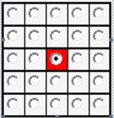
The 25 worksheets are represented by the 25 dots on the right. You can give each worksheet a unique name for orientation. In principle, however, a single worksheet can be sufficient. The green page is the start page of the respective station. Standard is always the middle. |
| Options for the |
Below the worksheets is a selection of the stations. Here, further functions can be set by selecting the station using the Options button. You can select a station, select a worksheet, and click Setas Start Page in Options. You can also copy a current worksheet, select another and paste it. |
| Hiding elements | During editing, the hotspots and info blocks are visible. Here you can disable this visibility to get an impression of the finished result. |
| Highlight selection | If an object is selected, everything else will be displayed slightly darker with this setting. |
| Hotspots | If you use a background image, the hotspots can be used to define action areas that trigger functions. These hotspots remain invisible over the desired area. |
| infoblock |
An info block is text area that displays the text or variable information you have entered. Example for a table: turnover, reservations, duration since last booking etc.). The info block changes its background colour depending on the settings ( reservations, own tables etc.). ). The size of the info block is automatically adjusted if required by the content. If a component does not have an info block, the text is displayed in the middle of the component where the Table function is assigned, if necessary. The position of the text can then no longer be controlled. The background color of the object is changed. |
Basic procedure
This example assumes that you are using the existing components or have already created the desired components. You open the component catalogue and double-click on a component to load it into the overview. It is then best to place all components and elements as desired and then work out the details for them. A table should generally consist of at least one graphic element (circle, rectangle) and an info block. The area of the Table element is automatically defined as a hotspot:

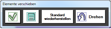
When you select a table, it is displayed in the lower area as a grouped object with its individual elements and can also be edited in this way:

Within the grouped display, each element can be set and adjusted separately. The desired function Table 22: has been set here:

By entering the table number in the group, it is automatically given to the individual seats:

If you later select the table on the touch screen, the graphic table overview is hidden and the cashier mode with the open table 22, correspondingly the selected seat at table 22 is opened if you have selected it.
Switching rooms
You can store several room plans or seating arrangements of identical rooms. to switch between them, you can set up corresponding functions as buttons.
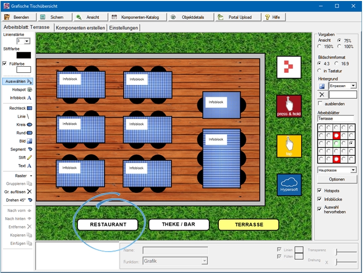
In this example there are three worksheets: restaurant, bar and terrace. (Unfortunately, the function Portal Upload is not currently available).
Select a component or element and connect it to the desired function by choosing Select. Some functions require additional settings.


You select editing in the MCP in the Administration sector in the POS Settings programme group to edit the worksheets. The programme has three tabs, the basic settings, editing components (tables, switches etc.) and worksheet:

| Element / Switch | Function / Description |
|---|---|
| Save | Saves the current graphical table overview and all settings. |
| view | Shows a real view ( Preview ). If the variant "in keyboard" is switched on, no change is made. |
| Components Catalog |
Opens the components. Further topics: Create components |
| object details | Displays all detailed information about the selected object. |
Toolbar...
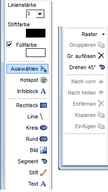
The toolbar is modelled on the usual graphic programmes: line thickness, pen colour, fill colour, pen and fill colour can be set, fill can optionally be switched off, by selecting the colour fields a colour dialogue opens and offers colours for application.
| Element / Switch | Function / Description |
|---|---|
| text | A text field for entering a text and the font / size. |
| raster | A grid can be set ( 5 - 50 points ). The grid is displayed during activation. |
| Group | Multiple elements can be grouped together to form a single object |
| Break up grouping | Dissolving a group into its components ( elements ). |
| Turning 45 | The active element is rotated in 45 degree steps. This variant is better than the free rotation if the result is to appear uniform. |
| Forward / Backward | Changes the order of objects and decides which is top / bottom / front / back). |
| arrow keys |
Use the arrow keys on your keyboard to precisely move a selected item or component. If you also press the Altkey, you will move exactly one point per keystroke. This is used for fine adjustments. |
Back to the overarching topic: Graphic table overview